CSS Filter
.movie-card.unavailable {
  filter: grayscale(100%);
}

.movie-card:hover {
  filter: brightness(1.2);
}

.hero-bg {
  filter: blur(4px);
}
Let me ask you something.
Have you ever seen a movie card on a streaming site that turns grayscale when it is unavailable? Or a background image that looks slightly blurred behind a modal? Or a profile photo with a subtle brightness boost?
All of that is the CSS filter property. One line and you can completely change how an element looks.
What is Filter
Filter applies visual effects directly to an element — blur, brightness, contrast, grayscale, and more. It works on images, divs, buttons, anything.
element {
  filter: effect(value);
}
Let us go through the ones you will actually use.
filter: grayscale
Removes color from an element. 0% is full color. 100% is completely gray.
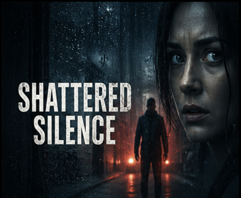
The second card is now gray and slightly faded — exactly how streaming platforms show unavailable content.
Here is what is happening.
filter: grayscale(100%) — strips all color from the card. Combined with opacity: 0.6 it
looks clearly unavailable without being hidden.
filter: blur
Blurs an element. Higher values mean more blur.
The background is blurred creating a frosted glass background effect. You will see this technique constantly — a blurred version of an image sitting behind text to make it readable.
When you blur an element the blur effect bleeds past the edges leaving a soft halo. Adding
overflow: hidden to the parent clips that bleed cleanly.
filter: brightness
Controls how bright or dark an element is. 1 is normal. Below 1 is darker. Above
1 is brighter.
Hover over any card and it brightens slightly. A subtle way to signal interactivity — different from the scale effect we already have.
Combining Filters
You can stack multiple filters on one element by writing them one after another.
The image is half desaturated and slightly darkened at the same time. Both filters apply together.
filter applies to the whole element including its children. If you want to filter just a background
image but not the text on top, use a pseudo-element for the background instead and filter that.
Building the Netflix Clone
Let us add grayscale to unavailable cards and brightness on hover as an alternative to the overlay effect.
Trending Now
Here is what is happening.
.movie-card:hover filter: brightness(1.15) — available cards brighten slightly on hover instead of
using a dark overlay. Feels more like a spotlight effect.
.movie-card.unavailable — the third card is grayed out at half opacity with
cursor: not-allowed to make it clearly unclickable.
.movie-card.unavailable:hover — overrides the hover state so unavailable cards do not scale or
brighten. They stay flat and unresponsive no matter what the user does.
Have anything to say about this lesson?
Your feedback helps improve these tutorials. If something was confusing or missing, let us know.