Project: Netflix Clone
Every lesson you've done has been building toward this moment. Open VS Code, create two files — index.html and style.css — and follow every step below.
Step 1: The HTML Structure
Create your index.html file and type this full structure. This is the skeleton of the entire page.
<!DOCTYPE html>
<html lang="en">
<head>
<meta charset="UTF-8">
<meta name="viewport" content="width=device-width, initial-scale=1.0">
<title>Netflix Clone</title>
<link rel="preconnect" href="https://fonts.googleapis.com">
<link rel="preconnect" href="https://fonts.gstatic.com" crossorigin>
<link href="https://fonts.googleapis.com/css2?family=Bebas+Neue&family=Roboto:wght@300;400;700&display=swap" rel="stylesheet">
<link rel="stylesheet" href="style.css">
</head>
<body>
<!-- TOP BAR -->
<nav class="top-bar">
<div class="logo">NETFLIX</div>
<button class="sign-in-btn">Sign In</button>
</nav>
<!-- HERO SECTION -->
<section class="hero">
<h1 class="hero-title">Unlimited movies, TV shows, and more</h1>
<p class="hero-subtitle">Starts at USD 2.99. Cancel anytime.</p>
<p class="hero-cta-text">Ready to watch? Enter your email to create or restart your membership.</p>
<form class="hero-form">
<input type="email" placeholder="Email address" class="hero-input">
<button type="submit" class="hero-btn">Get Started ></button>
</form>
</section>
<!-- TRENDING SECTION -->
<section class="content-section">
<h2 class="row-title">Trending Now</h2>
<div class="movie-row">
<div class="movie-card">
<img src="https://occ-0-7254-2186.1.nflxso.net/dnm/api/v6/mAcAr9TxZIVbINe88xb3Teg5_OA/AAAABcgE2p0rLBllX45kwT98woah-ZOlFFRzICsJBWWAjkfbtAK3StFZEQyk2QdqpPvi8cbmB_M0HaaDN_LLH2jKbQRLWe4wWMui0jn3ONXVrBqeMnU1XDaoFVfQm3bQQG9-mjlL.jpg?r=0af" alt="The Witcher">
<span class="card-title">The Witcher</span>
</div>
<div class="movie-card">
<img src="https://occ-0-7254-2186.1.nflxso.net/dnm/api/v6/mAcAr9TxZIVbINe88xb3Teg5_OA/AAAABXTgkhmaQTqVqZWQpU6KcZlwBYvnrX5MTQatuonAXBk8F7-PcyiPtUhO0lD4-feRRw_GvjwVhHxlkvtpXF4T4lfHs-aaYJa0cNs.jpg?r=a26" alt="Squid Game">
<span class="card-title">Squid Game</span>
</div>
<div class="movie-card">
<img src="https://occ-0-7254-2186.1.nflxso.net/dnm/api/v6/mAcAr9TxZIVbINe88xb3Teg5_OA/AAAABX04eZFeuzxRxlBcsdsrl5az5RX7R_kpmMlIZijxOUjn3ODejcccCsLin87Ic6qMLGWScu-dBSVqq6MzS47a17_6OpIbR7LAEUA.jpg?r=af3" alt="Breaking Bad">
<span class="card-title">Breaking Bad</span>
</div>
<div class="movie-card">
<img src="https://occ-0-7254-2186.1.nflxso.net/dnm/api/v6/mAcAr9TxZIVbINe88xb3Teg5_OA/AAAABVgzdeZGRAwCEa709VhH3rjzGTNzIDlWer-mLr3GaH6qm10zCfxxN-E1-JYCA8CxkoBD74MIuxW1agaVLL4kUpFTtsZPIuTfAV1ljNzcrTPup4487rDCgRuZm-Jn8fUi1cVx.jpg?r=d90" alt="Money Heist">
<span class="card-title">Money Heist</span>
</div>
<div class="movie-card">
<img src="https://occ-0-7254-2186.1.nflxso.net/dnm/api/v6/mAcAr9TxZIVbINe88xb3Teg5_OA/AAAABUvQbIPXgpCDdCjDU1Ln9Hz_T9K4QWOeRqDC0_AqSS0EoDHnd3HZNvdU660QoLXfYN1J1onlnVJ6me4utt0EuPA35nq3AvkxOz4.jpg?r=00a" alt="Dark">
<span class="card-title">Dark</span>
</div>
</div>
</section>
<!-- MORE LIKE THIS -->
<section class="content-section">
<h2 class="row-title">More to Watch</h2>
<div class="movie-grid">
<div class="movie-card"><img src="https://occ-0-7254-2186.1.nflxso.net/dnm/api/v6/mAcAr9TxZIVbINe88xb3Teg5_OA/AAAABcgE2p0rLBllX45kwT98woah-ZOlFFRzICsJBWWAjkfbtAK3StFZEQyk2QdqpPvi8cbmB_M0HaaDN_LLH2jKbQRLWe4wWMui0jn3ONXVrBqeMnU1XDaoFVfQm3bQQG9-mjlL.jpg?r=0af" alt="Movie"></div>
<div class="movie-card"><img src="https://occ-0-7254-2186.1.nflxso.net/dnm/api/v6/mAcAr9TxZIVbINe88xb3Teg5_OA/AAAABXTgkhmaQTqVqZWQpU6KcZlwBYvnrX5MTQatuonAXBk8F7-PcyiPtUhO0lD4-feRRw_GvjwVhHxlkvtpXF4T4lfHs-aaYJa0cNs.jpg?r=a26" alt="Movie"></div>
<div class="movie-card"><img src="https://occ-0-7254-2186.1.nflxso.net/dnm/api/v6/mAcAr9TxZIVbINe88xb3Teg5_OA/AAAABX04eZFeuzxRxlBcsdsrl5az5RX7R_kpmMlIZijxOUjn3ODejcccCsLin87Ic6qMLGWScu-dBSVqq6MzS47a17_6OpIbR7LAEUA.jpg?r=af3" alt="Movie"></div>
<div class="movie-card"><img src="https://occ-0-7254-2186.1.nflxso.net/dnm/api/v6/mAcAr9TxZIVbINe88xb3Teg5_OA/AAAABVgzdeZGRAwCEa709VhH3rjzGTNzIDlWer-mLr3GaH6qm10zCfxxN-E1-JYCA8CxkoBD74MIuxW1agaVLL4kUpFTtsZPIuTfAV1ljNzcrTPup4487rDCgRuZm-Jn8fUi1cVx.jpg?r=d90" alt="Movie"></div>
<div class="movie-card"><img src="https://occ-0-7254-2186.1.nflxso.net/dnm/api/v6/mAcAr9TxZIVbINe88xb3Teg5_OA/AAAABUvQbIPXgpCDdCjDU1Ln9Hz_T9K4QWOeRqDC0_AqSS0EoDHnd3HZNvdU660QoLXfYN1J1onlnVJ6me4utt0EuPA35nq3AvkxOz4.jpg?r=00a" alt="Movie"></div>
<div class="movie-card"><img src="https://occ-0-7254-2186.1.nflxso.net/dnm/api/v6/mAcAr9TxZIVbINe88xb3Teg5_OA/AAAABcgE2p0rLBllX45kwT98woah-ZOlFFRzICsJBWWAjkfbtAK3StFZEQyk2QdqpPvi8cbmB_M0HaaDN_LLH2jKbQRLWe4wWMui0jn3ONXVrBqeMnU1XDaoFVfQm3bQQG9-mjlL.jpg?r=0af" alt="Movie"></div>
</div>
</section>
<!-- FOOTER -->
<footer class="footer">
<p>Questions? Call 1-844-505-2993</p>
<div class="footer-links">
<a href="#">FAQ</a>
<a href="#">Help Centre</a>
<a href="#">Terms of Use</a>
<a href="#">Privacy</a>
</div>
<p class="footer-copy">Netflix Clone — built with CSS</p>
</footer>
</body>
</html>Step 2: The CSS Reset and Base Styles
Create your style.css file. Start with the reset and base styles — these apply to every element on the page.
/* ── Reset ──────────────────────────────────── */
* {
  margin: 0;
  padding: 0;
  box-sizing: border-box;
}

/* ── Base ──────────────────────────────────── */
body {
  background-color: #141414;
  color: white;
  font-family: "Roboto", Arial, sans-serif;
}
Step 3: The Top Bar
The navbar is fixed at the top and uses Flexbox to push the logo and button to opposite ends.
/* ── Top Bar ──────────────────────────────── */
.top-bar {
  position: fixed;
  top: 0;
  left: 0;
  right: 0;
  z-index: 100;
  display: flex;
  justify-content: space-between;
  align-items: center;
  padding: 16px 48px;
  background: linear-gradient(to bottom, rgba(0,0,0,0.9) 0%, transparent 100%);
}

.logo {
  color: #e50914;
  font-family: "Bebas Neue", Arial, sans-serif;
  font-size: 32px;
  letter-spacing: 3px;
}

.sign-in-btn {
  background-color: #e50914;
  color: white;
  border: none;
  padding: 8px 18px;
  border-radius: 4px;
  font-size: 14px;
  font-weight: 700;
  font-family: "Roboto", sans-serif;
  cursor: pointer;
  transition: background-color 0.2s ease;
}

.sign-in-btn:hover {
  background-color: #f40612;
}
Step 4: The Hero Section
The hero takes the full viewport height, centers all its content, and uses a background image with a dark tint.
/* ── Hero ──────────────────────────────────── */
.hero {
  position: relative;
  min-height: 100vh;
  display: flex;
  flex-direction: column;
  justify-content: center;
  align-items: center;
  text-align: center;
  padding: 100px 40px 60px;
  background-color: rgba(0, 0, 0, 0.65);
  background-image: url('https://assets.nflxext.com/ffe/siteui/vlv3/9ba9f0e2-b246-47f4-bd1f-3e84c23a5db8/web/NP-en-20251020-TRIFECTA-perspective_774f89dc-b75d-4cfc-b1fe-52086741fae3_large.jpg');
  background-blend-mode: multiply;
  background-size: cover;
  background-position: center;
}

/* Bottom fade into the dark background */
.hero::after {
  content: "";
  position: absolute;
  bottom: 0;
  left: 0;
  right: 0;
  height: 120px;
  background: linear-gradient(to bottom, transparent, #141414);
}

.hero-title {
  font-family: "Roboto", sans-serif;
  font-size: clamp(32px, 5vw, 56px);
  font-weight: 700;
  max-width: 700px;
  line-height: 1.2;
  margin-bottom: 16px;
}

.hero-subtitle {
  font-size: clamp(16px, 2.5vw, 22px);
  font-weight: 400;
  margin-bottom: 12px;
}

.hero-cta-text {
  font-size: 18px;
  color: rgba(255, 255, 255, 0.85);
  margin-bottom: 20px;
}

.hero-form {
  display: flex;
  gap: 8px;
  width: 100%;
  max-width: 600px;
}

.hero-input {
  flex: 1;
  padding: 16px 18px;
  font-size: 16px;
  border: 1px solid rgba(255, 255, 255, 0.3);
  border-radius: 4px;
  background-color: rgba(0, 0, 0, 0.55);
  color: white;
  font-family: "Roboto", sans-serif;
}

.hero-input::placeholder {
  color: rgba(255, 255, 255, 0.55);
}

.hero-btn {
  background-color: #e50914;
  color: white;
  border: none;
  padding: 16px 28px;
  font-size: 20px;
  font-weight: 700;
  border-radius: 4px;
  cursor: pointer;
  white-space: nowrap;
  font-family: "Roboto", sans-serif;
  transition: background-color 0.2s ease;
}

.hero-btn:hover {
  background-color: #f40612;
}
Step 5: The Content Sections
The trending row uses Flexbox with horizontal scrolling. The grid section uses CSS Grid with auto-fill columns.
/* ── Content Sections ─────────────────────── */
.content-section {
  padding: 32px 48px;
}

.row-title {
  font-size: 22px;
  font-weight: 700;
  margin-bottom: 12px;
}

/* Horizontal scrolling row */
.movie-row {
  display: flex;
  gap: 8px;
  overflow-x: auto;
  padding-bottom: 8px;
}

.movie-row::-webkit-scrollbar {
  display: none;
}

/* Wrapping grid */
.movie-grid {
  display: grid;
  grid-template-columns: repeat(auto-fill, minmax(160px, 1fr));
  gap: 8px;
}

/* ── Movie Cards ──────────────────────────── */
.movie-card {
  position: relative;
  flex-shrink: 0;
  width: 200px;
  aspect-ratio: 16 / 9;
  border-radius: 4px;
  overflow: hidden;
  cursor: pointer;
  transition: transform 0.3s ease, box-shadow 0.3s ease;
}

/* Grid cards fill the column instead of fixed width */
.movie-grid .movie-card {
  width: 100%;
}

.movie-card:hover {
  transform: scale(1.08);
  box-shadow: 0 12px 40px rgba(0, 0, 0, 0.8);
  z-index: 1;
}

.movie-card img {
  width: 100%;
  height: 100%;
  object-fit: cover;
  display: block;
}

/* Gradient overlay — shown on hover */
.movie-card::after {
  content: "";
  position: absolute;
  inset: 0;
  background: linear-gradient(
    to top,
    rgba(0, 0, 0, 0.85) 0%,
    transparent 60%
  );
  opacity: 0;
  transition: opacity 0.3s ease;
}

.movie-card:hover::after {
  opacity: 1;
}

.card-title {
  position: absolute;
  bottom: 8px;
  left: 10px;
  color: white;
  font-size: 13px;
  font-weight: 700;
  z-index: 1;
  opacity: 0;
  transition: opacity 0.3s ease;
}

.movie-card:hover .card-title {
  opacity: 1;
}
Step 6: The Footer
/* ── Footer ───────────────────────────────── */
.footer {
  padding: 48px;
  background-color: #000;
  color: rgba(255, 255, 255, 0.5);
  font-size: 13px;
  line-height: 2;
}

.footer-links {
  display: flex;
  flex-wrap: wrap;
  gap: 16px;
  margin: 16px 0;
}

.footer-links a {
  color: rgba(255, 255, 255, 0.5);
  text-decoration: none;
}

.footer-links a:hover {
  text-decoration: underline;
  color: white;
}

.footer-copy {
  margin-top: 8px;
}
Step 7: Responsive Design
/* ── Responsive ───────────────────────────── */
@media (max-width: 600px) {
  .top-bar {
    padding: 12px 20px;
  }

  .logo {
    font-size: 24px;
  }

  .hero {
    padding: 80px 20px 40px;
  }

  .hero-form {
    flex-direction: column;
  }

  .content-section {
    padding: 24px 20px;
  }

  .movie-card {
    width: 150px;
  }

  .footer {
    padding: 32px 20px;
  }
}
See It All Together
Click Try It Yourself to see the complete Netflix clone running — all in the browser, built entirely with HTML and CSS.
Unlimited movies, TV shows, and more
Starts at USD 2.99. Cancel anytime.
Ready to watch? Enter your email to get started.
Trending Now
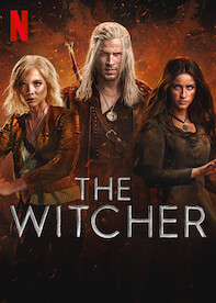 The Witcher
 Squid Game
 Breaking Bad
 Money Heist
 Dark
DarkYou built this. A dark hero with a background image and tint, a fixed navbar, a scrollable movie row with hover effects, and a footer — all from CSS you learned lesson by lesson.
Have anything to say about this lesson?
Your feedback helps improve these tutorials. If something was confusing or missing, let us know.