CSS Padding
button {
  padding: 12px 32px;
}

h1 {
  padding-top: 60px;
  padding-bottom: 20px;
}
Let me ask you something.
Have you ever seen a button where the text was squished right up against the edges? Or a section where the text started right at the very edge of the screen with no breathing room at all?
It feels cramped. Uncomfortable. Like someone forgot to finish the design.
That is a padding problem. And fixing it is one of the simplest things you can do to make your page feel more polished and intentional.
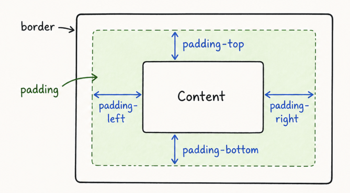
What is Padding
Padding is the space between the content of an element and its own edges.
Think of it like a picture frame. The photo is the content. The padding is the white border around the photo inside the frame. The frame itself is the element. The padding just creates breathing room between what is inside and the edges of the box.
In CSS you add it using the padding property.
The button now has 16px of space on all four sides between the text and the edges of the button. It feels much more comfortable and clickable.
Padding on All Four Sides at Once
When you write padding with one value it applies the same space to all four sides — top, right, bottom,
and left.
20px of space on every side equally.
But you can also control each side separately using two values, three values, or four values. This is where it gets really useful.
Two values — the first controls top and bottom, the second controls left and right.
12px on the top and bottom, 32px on the left and right. This is the classic button padding shape — wider than it is tall. Most buttons you see on real websites use this pattern.
Four values — top, right, bottom, left. Goes clockwise starting from the top.
10px top, 30px right, 14px bottom, 30px left.
An easy way to remember the order of four values is the word TRBL — Top, Right, Bottom, Left. Or think of it like a clock starting at 12 and going clockwise. Top, Right, Bottom, Left. Once this clicks you will never forget it.
Padding on Individual Sides
You can also set each side separately using its own property.
Unlimited movies, TV shows, and more.
Starts at USD 2.99. Cancel anytime.
h1 { padding-top: 60px; padding-bottom: 20px; color: white; } p { padding-left: 40px; padding-right: 40px; color: white; } body { background-color: #141414; }The heading has extra space above and below it. The paragraphs have space on the sides so they do not touch the edges.
This is useful when you only need to adjust one or two sides without touching the others.
In real projects you will find yourself using padding shorthand most of the time — padding: 12px 32px
is cleaner and faster to write than four separate lines. Use individual properties only when you need to override
one specific side without changing the others.
What Padding Actually Does to Your Element
Here is something important to understand. When you add padding to an element it makes the element bigger.
If you have a button that is 100px wide and you add 20px of padding on each side the button does not stay 100px. It becomes 140px wide — 100px of content plus 20px on the left plus 20px on the right.
This can sometimes cause layout surprises. We will talk about how to control this behavior when we get to the box model lesson. For now just know that padding adds to the size of the element.
Building the Netflix Clone
Our Netflix clone is looking better but everything still feels too close together and too close to the edges. Let us fix that with padding.
Netflix
Unlimited movies, TV shows, and more.
Starts at USD 2.99. Cancel anytime.
Ready to watch? Enter your email to create or restart your membership.
body { font-family: "Roboto", Arial, sans-serif; font-size: 16px; padding: 40px; background-image: linear-gradient(to bottom, rgba(0,0,0,0.7), rgba(0,0,0,0.4)), url("https://assets.nflxext.com/ffe/siteui/vlv3/9ba9f0e2-b246-47f4-bd1f-3e84c23a5db8/web/NP-en-20251020-TRIFECTA-perspective_774f89dc-b75d-4cfc-b1fe-52086741fae3_large.jpg"); background-size: cover; background-position: center; background-repeat: no-repeat; text-align: center; } #logo { font-family: "Bebas Neue", sans-serif; font-size: 3rem; font-weight: 700; color: #E50914; letter-spacing: 4px; line-height: 1; } h1 { font-family: "Bebas Neue", sans-serif; font-size: 3rem; font-weight: 700; color: white; letter-spacing: 2px; line-height: 1.2; } p { font-size: 1.1rem; font-weight: 300; color: white; line-height: 1.6; } button { background-color: #E50914; color: white; font-size: 1rem; font-weight: 600; text-transform: uppercase; letter-spacing: 2px; padding: 12px 32px; }The body now has breathing room on all sides so nothing touches the edges of the screen. The buttons have that classic wide padding shape that makes them feel satisfying to click. Everything feels more spacious and intentional.
Have anything to say about this lesson?
Your feedback helps improve these tutorials. If something was confusing or missing, let us know.