CSS Object Fit
.movie-card img {
  width: 100%;
  height: 100%;
  object-fit: cover;
  object-position: center top;
}
Let me ask you something.
Have you ever put an image inside a fixed size container and it came out stretched or squished? A face that looks wide and distorted. A landscape photo that looks tall and compressed. The image is there but it looks wrong.
That is what happens when you force an image into a size it was not designed for without telling CSS how to handle it. Object-fit is the fix.
What is Object Fit
Object-fit controls how an image or video fills its container. It tells the browser what to do when the image dimensions do not match the container dimensions.
Without object-fit the image stretches to fill exactly the width and height you gave it. With object-fit you can tell it to fill the space while keeping its original proportions.
The Problem First
Let us see the problem clearly before we fix it.
The images fill the cards but they look stretched and distorted. The proportions are broken because we forced the image to be exactly 160px by 100px regardless of its actual dimensions.
Now let us fix it.
object-fit: cover
Cover scales the image up until it fills the container completely. It maintains the original proportions. Any part of the image that does not fit is cropped out.
The images now fill their cards perfectly without any distortion. The proportions are maintained and the overflow is hidden cleanly by the card container.
Here is what is happening.
object-fit: cover — the image scales to fill the full width and height of its container. The aspect
ratio is preserved. Anything that spills outside the container is cropped. You never see empty space and you never
see stretching.
This is the value you will use for almost every image in a fixed size container. Movie cards, profile photos, hero backgrounds, blog post thumbnails — they all use cover.
object-fit: cover is the most used value by a wide margin. Any time you have an image inside a fixed
container just add object-fit: cover and it will look right. Make it a habit to always include it when
sizing images.
object-fit: contain
Contain scales the image down until the whole image fits inside the container. Nothing gets cropped. But you may see empty space around the image if the proportions do not match.
The full image is visible but you will see dark space on the sides or top and bottom depending on the image proportions.
Use contain when you need the entire image visible — like a product photo, a logo, or a diagram where cropping would cut off important content.
object-fit: none
None displays the image at its natural size ignoring the container dimensions entirely. The image does not scale at all.
You will see just a portion of the image — whatever falls within the 160x100 container. The image is not scaled at all.
You will rarely use none in practice but it is useful when you want to show a specific cropped portion of an image without scaling.
object-position
By default cover centers the image inside the container. But sometimes the most important part of the image is not in the center — like a face near the top or a subject on the left side.
Object-position controls where the image is anchored inside the container.
Three cards with the same image but each shows a different part of it. Center shows the middle, top shows the upper portion, bottom shows the lower portion.
Here is what is happening.
object-position: center — the default. The image is centered inside the container. Equal amounts are
cropped from each side.
object-position: top — the image is anchored to the top. The bottom gets cropped. Useful for portraits
where the face is at the top.
object-position: bottom — the image is anchored to the bottom. The top gets cropped.
You can also use left, right, or specific values like
object-position: 30% 20% for precise control.
When your images have a subject that keeps getting cropped out by object-fit: cover try adjusting
object-position. A portrait where the face disappears just needs object-position: top. A
landscape where the horizon gets cut needs object-position: center or bottom. This one
property saves a lot of awkward cropping situations.
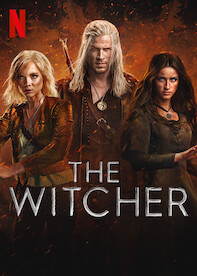
Building the Netflix Clone
Our movie cards already use object-fit: cover throughout. Let us make sure every image in the clone is
using it properly and add object-position where it makes sense.
Trending Now

Here is what is happening.
object-fit: cover — every card image fills its container without distortion. This is the foundation.
object-position: center top — the image is anchored to the center horizontally and the top vertically.
Since our movie thumbnails have titles and subjects near the top this keeps the most important part of each image
visible even after cropping.
Transition on the img itself — the image inside the card has its own subtle scale transition on hover.
Combined with the card scaling up this creates a layered zoom effect. The card scales to 1.08 and the image inside
scales to an additional 1.05 giving a pleasing depth effect.
Have anything to say about this lesson?
Your feedback helps improve these tutorials. If something was confusing or missing, let us know.